"Two pounds of wheat for a day's wages." --Revelation 6:6 (NIV)
In football and near the end of the game, there is a two-minute warning which stops play, so that teams can think of how they will strategize as the game is about to end.
The United States is also currently at a spot where it looks like the game is about to end, and there will be a declaration of a winner and a loser. As the quote from Revelation insinuates at top, the end-game involves us working all day, just to barely obtain enough food to survive.
Many people have a feeling that the game is almost up, and that we can slide on a slippery-slope to some kind of totalitarianism: some kind of fascism.
There is talk about a "vaccine passport" to control domestic movement of U.S. citizens, and even about how that can shift into a government-controlled bank account.
That kind of thing would take "Cancel Culture" to a whole new level.
In fascist and communist regimes, leaders can 'erase' you from history if they desire to, but that is not what the founders of the United States of America had in mind. Imagine if a government bureaucrat could cancel your bank account with the press of a button.
How did we get here?
It can be surprising to look back on the last few years in the U.S., because everything seemed to be going at least pretty well.
There is still food in the refrigerator, and there are still cars on the road. And doesn't that mean that we in the U.S. are still well off, despite the anti-freedom actions of U.S. politicians?
But that appearance is just a deliberate mirage in order to hide the fact that government has been making it harder to make a living. There'll still be food in the refrigerator, and cars on the road, when a point-of-no-return is reached.
The famous analogy is that of a boiling frog. When boiled slowly, the frog doesn't jump out of the pot. Each minute feels just as hot as the last one, until it is too late to jump out.
And so it is with us. Each new day, we tend to "feel" about as wealthy as we were the day before (although recent spikes in inflation indicate otherwise).
To make it feel like we haven't had our living standards dramatically lowered by political policies in the U.S., government officials have incentives to come up with rosy figures about things such as inflation.
Combine those rosy statistics with all of the fancy new gadgets like flat-screen television sets and, on the surface, it feels like our fortunes and our futures are not being destroyed by anti-freedom government policies.
Just how financially dire?
The conventional index for inflation is the Consumer Price Index, or CPI, but it now involves subjective evaluations about whether dollars stretch more than before, because of qualitative changes in products.
Here is a deliberately-extreme analogy: If a government bureaucrat thinks that an 8k television set has twice the quality of a 4k one -- then that bureaucrat only counts it as a price increase if the price rises by more than 100%.
If all TV sets went to 8k, but the price only went up 50% from the 4k models available before, then the bureaucrat would count it as deflationary -- even though everyone is paying 50% more for TVs.
Instead of using the CPI below as a measure of real inflation, I use the Social Security Administration's data on wage inflation, which I believe more accurately depicts the real inflation faced by American consumers.
The following graph takes all private sector wages and divides them by all employable (non-institutionalized) US adults, to get a picture of the average wage earned per US adult, regardless of employment status for any particular person.
If things go well, the real total wages paid out rises faster than the population growth rate of US adults -- and people can afford a higher standard of living.
This was true in our "golden years" from 1958 to 1969, when real wages paid per U.S. adult increased by 1% each year, even while the adult population was increasing:
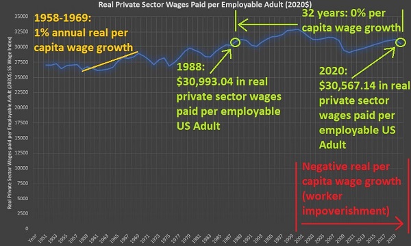
As you can see, the right side of the chart is more depressing than the left side. To be fair, around the time when the Cold War ended, a billion new workers were added to the world's labor force, competing for wages worldwide.
But the US had two choices back then:
1) prepare for the influx of new, low-cost workers by increasing freedom
2) keep on the path to socialism/fascism, but build mirages for the people
We chose option #2 -- i.e., stay with policies which lead to a desert of poverty, but create mirages to make people think they are still wealthy.
Workers in 2020 had less purchasing power than workers in 1988 -- 32 years prior. That's 3 full decades of wage stagnation, though transiently interrupted by a spurious increase in the middle, due to temporary asset bubbles like the dot.com bubble and the one in housing.
An argument can be made that, while wages in the U.S. have not improved for 32 years now, we're still better off than most others in most places and in most times.
But are we really better off?
It's hard to know how good you would have had it, if you had been left perfectly free. The next graph is guilty of embellishment, because I deliberately chose one of the best times in the distant past in order to compare it to modern-day America.
To find out how much in real objects your paycheck buys, you'd need an object which doesn't change in quality over time. I chose wheat as a commodity and looked at historically-distant wages in terms of how much a day's worth of labor could buy:
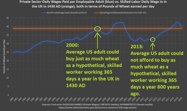
In order to embellish, I created a hypothetical flat orange line on the graph indicating the amount of wheat bought with a day's worth of skilled labor back in England in the year of 1430 AD -- and went further to assume no days off for this historical worker.
This is "unfair" because the U.S. adults tracked by the blue line are not even all working, let alone working for 365 days out of the year.
The blue line is the average of all private wages paid to all U.S. adults, but it should STILL be much higher than what was at least theoretically possible to a 'never-tiring' (no days off) skilled worker 600 years ago.
And the problem is that it isn't.
And a problem with having stagnant wages when improvements in living standards are desired -- is that it leads us to live beyond our means.
Hard evidence of living beyond our means
While the graphs above indicate that things are not improving in the U.S. -- at least not for those who earn private sector wages in the U.S. -- they do not indicate if we are back-sliding into a big, black hole of debt.
The federal government is the largest debtor there is, surpassing all of the U.S. households and all of the U.S. businesses when they are viewed separately:
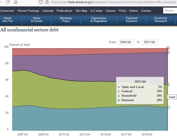
The purple-shaded area above is the federal government share of all debt. Roughly 40 cents of every dollar of debt comes from federal government debt, and it threatens the prospects of our future and that of our children.
It wasn't always the case though, and that is even seen in 2007 in the graph above, where the purple-shaded area was less of the total.
When looking at debt it is important to compare it to total held assets. The debt-free portion of assets is owned outright, and called equity.
It's not what you have that counts most, because you could have tons of assets bought with debt. Instead, it is what you "own" that counts.
Here is an example:
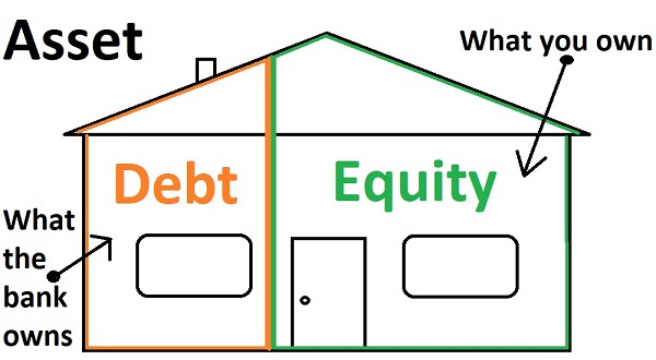
The situation above is very manageable. In terms of total assets held, the outstanding debt at left (orange) only represents about a third of all material assets.
The amount which is owned outright (the equity in green on the right) is about twice as much as the debt outstanding shown at left. That right side, the equity, is a measure of wealth.
This healthy, manageable debt situation approximates the debt position for the US overall, back in 1981:
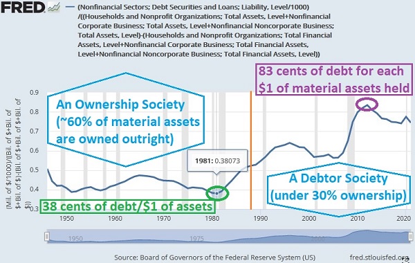
Note how the right side is more depressing than the left. We went from an ownership society to a debtor society. And this graph shows all material assets for all households and all businesses.
Even worse is the situation for the bottom half of America where, for the first time in U.S. history, the bottom half of us had held debt at such high levels that it was 30% greater than the market value of everything that we owned:
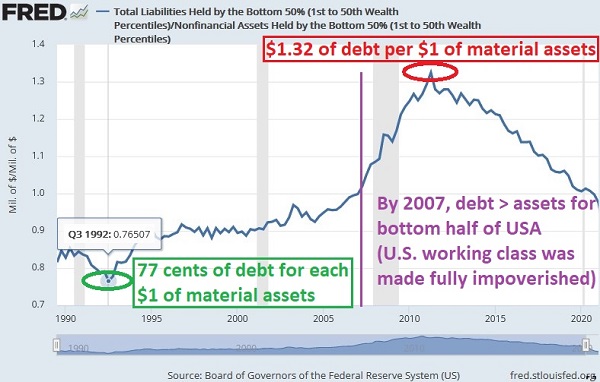
To be fair, the situation was improving at the very right edge of the graph, but the total debt held by the bottom half still effectively reduced wealth down to 0% for them.
You can't have a bright future as a nation, if half of everyone has zero wealth -- because the debt they carry is worth as much as all of the material objects that they own.
The worst aspect is a looming sovereign debt crisis, and the 'national bankruptcy' experience around 2010 in Greece is instructive:
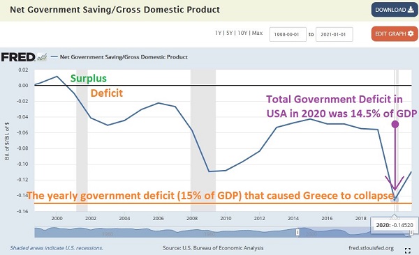
We have to turn things around in the US. There is no bright future for us on the current path we are on. A Convention of States can literally save America, and it appears now that it will be a requirement if there is to be a peaceful solution to the coming troubles.
It is "that late" in the game now.
Reference
Assets
Bottom 50% Material (nonfinancial) Assets:
Board of Governors of the Federal Reserve System (US), Nonfinancial Assets Held by the Bottom 50% (1st to 50th Wealth Percentiles) [WFRBLB50082], retrieved from FRED, Federal Reserve Bank of St. Louis; https://fred.stlouisfed.org/series/WFRBLB50082
Business Financial-only Assets (corporate):
Board of Governors of the Federal Reserve System (US), Nonfinancial Corporate Business; Total Financial Assets, Level [TFAABSNNCB], retrieved from FRED, Federal Reserve Bank of St. Louis; https://fred.stlouisfed.org/series/TFAABSNNCB
Business Financial-only Assets (noncorporate):
Board of Governors of the Federal Reserve System (US), Nonfinancial Noncorporate Business; Total Assets, Level [TABSNNB], retrieved from FRED, Federal Reserve Bank of St. Louis; https://fred.stlouisfed.org/series/TABSNNB
Business Total Assets (corporate):
Board of Governors of the Federal Reserve System (US), Nonfinancial Corporate Business; Total Assets, Level [TABSNNCB], retrieved from FRED, Federal Reserve Bank of St. Louis; https://fred.stlouisfed.org/series/TABSNNCB
Business Total Assets (noncorporate):
Board of Governors of the Federal Reserve System (US), Nonfinancial Noncorporate Business; Total Assets, Level [TABSNNB], retrieved from FRED, Federal Reserve Bank of St. Louis; https://fred.stlouisfed.org/series/TABSNNB
Household & Nonprofit Financial-only Assets:
Board of Governors of the Federal Reserve System (US), Households and Nonprofit Organizations; Total Financial Assets, Level [TFAABSHNO], retrieved from FRED, Federal Reserve Bank of St. Louis; https://fred.stlouisfed.org/series/TFAABSHNO
Household & Nonprofit Total Assets:
Board of Governors of the Federal Reserve System (US), Households and Nonprofit Organizations; Total Assets, Level [TABSHNO], retrieved from FRED, Federal Reserve Bank of St. Louis; https://fred.stlouisfed.org/series/TABSHNO
Debt
Annual Total Government Deficit:
U.S. Bureau of Economic Analysis, Net Government Saving [TGDEF], retrieved from FRED, Federal Reserve Bank of St. Louis; https://fred.stlouisfed.org/series/TGDEF
Bottom 50% Total Debt:
Board of Governors of the Federal Reserve System (US), Total Liabilities Held by the Bottom 50% (1st to 50th Wealth Percentiles) [WFRBLB50100], retrieved from FRED, Federal Reserve Bank of St. Louis; https://fred.stlouisfed.org/series/WFRBLB50100
Federal Share of all Debt:
Board of Governors of the Federal Reserve System. Financial Accounts of the United States. Debt of Nonfinancial Sectors, 1952 - 2021. All nonfinancial sectors debt. https://www.federalreserve.gov/releases/z1/dataviz/z1/nonfinancial_debt/chart/
U.S. Total Debt:
Board of Governors of the Federal Reserve System (US), Nonfinancial Sectors; Debt Securities and Loans; Liability, Level [BOGZ1FL394104005Q], retrieved from FRED, Federal Reserve Bank of St. Louis; https://fred.stlouisfed.org/series/BOGZ1FL394104005Q
Output
U.S. Bureau of Economic Analysis, Gross Domestic Product [GDP], retrieved from FRED, Federal Reserve Bank of St. Louis; https://fred.stlouisfed.org/series/GDP
Population (noninstitutionalized adults)
U.S. Bureau of Labor Statistics, Population Level [CNP16OV], retrieved from FRED, Federal Reserve Bank of St. Louis; https://fred.stlouisfed.org/series/CNP16OV
Prices
Price of Whole Wheat Bread (per lb):
U.S. Bureau of Labor Statistics, Average Price: Bread, Whole Wheat, Pan (Cost per Pound/453.6 Grams) in U.S. City Average [APU0000702212], retrieved from FRED, Federal Reserve Bank of St. Louis; https://fred.stlouisfed.org/series/APU0000702212
Note on the above: Interpolation was used to connect any gaps where there were missing data.
Wages
Social Security Administration. National average wage indexing series, 1951-2020. Available: https://www.ssa.gov/oact/cola/AWI.html
U.S. Bureau of Economic Analysis, Wage and salary accruals: Domestic private industries [A4103C0A144NBEA], retrieved from FRED, Federal Reserve Bank of St. Louis; https://fred.stlouisfed.org/series/A4103C0A144NBEA
[historic UK prices and wages] The National Archives. Currency converter: 1270–2017. Available: https://www.nationalarchives.gov.uk/currency-converter/
Tip:
At the UK National Archives page above, set the year to 1430, and then put in 1000 in the next blank space -- to check what it is that a thousand British pounds sterling bought back then (in terms of both bread and also in terms of paid labor). The "quarters" of wheat which are listed there are each 480-lbs. With 2702 quarters of wheat showing, or 33,333 days of skilled labor, math calculations reveal that, back in 1430, one day of skilled labor bought 38.9-lbs of wheat.


